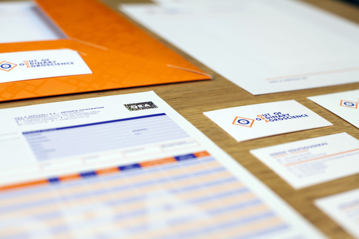
01. The first meeting. Outlining the project and the “design brief.”
The first contact with the clients takes place, during which the designer explains the procedure for the implementation of the project, while the clients have the opportunity to describe their goals and needs. The project is therefore defined to the point that both sides agree to what will be implemented. It is common practice for examples of previous work to be presented in the meeting, so that the clients can understand the logic behind the logo and corporate identity design. It is also important for the designer to understand what the clients do, and what their vision and style is. Often, customers haven’t clarified such issues before going to a creative agency, especially when it concerns a launch (new venture). In such cases they should receive appropriate assistance to define the identity of their work or of their product.
02. Cost estimation.
The definition of the project parameters becomes the basis of the estimation of the design cost and the implementation time. The project estimation is usually sent by email. After receiving the feedback of the client, the process proceeds to the next step. At this stage, the client can remove or add more applications of the corporate identity.
03. The financial offer.
If the estimation is accepted by the client, then the official quote which details all the terms of the agreement and has the form of a contract is sent. In it, the logic behind the costing is described. The client will also be able to see payment options, specific conditions concerning copyright and usage rights, confidentiality terms, preferred means of communication and of course the cost.
04. Naming.
One essential thing to consider before the actual design phase begins is the name that has been chosen for the company. Is it unique? Is it easy to read and write but also hear, remember and repeat? The logo, corporate identity and its applications may later change, but the name is what carries the history of a company or a product to its customers. It is what sticks and is very hard to change later, if ever.
In the case that the creative agency is requested to find the name, collaboration with a professional editor is necessary. Usually, each proposal constitutes a first basic idea for the company.
05. Research, design study, design and the first presentation.
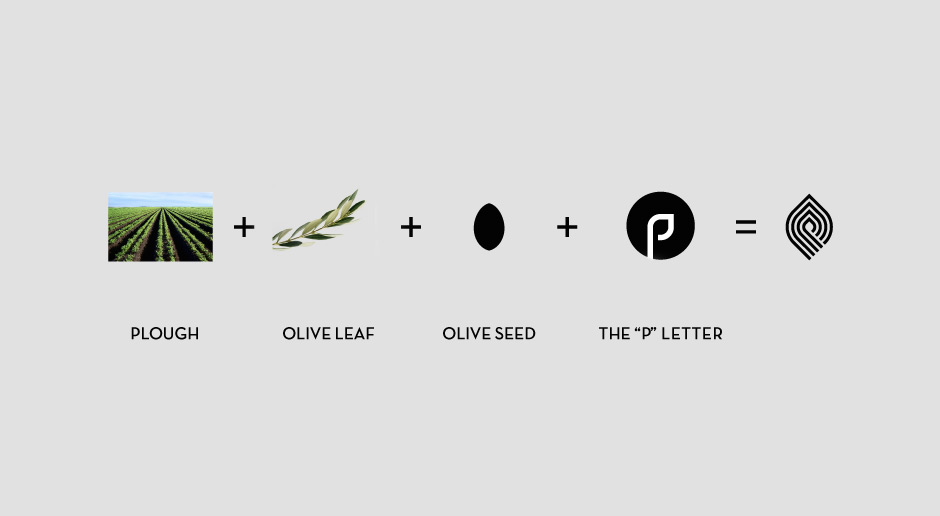
After setting the time schedule of the project and the client has agreed to it, the phase of research and of early drafts follows. Drafts should always be created as sketches. The basic principles in relation to the design of a logo are: To be authentic, unique, to function correctly as a monochrome print and also in both small and large dimensions. After this, the first designs are created and the choice of typography takes place.
Traditionally, the basic solutions for a logo are three:
a) logo with a symbol
b) logo with design detail in letters that maybe can work as a standalone symbol
c) a typographical symbol (logo as type), i.e. the writing itself is the final logo.
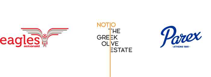
During the first client presentation, two to three design proposals are presented and the idea for each solution is explained. Monochrome and color versions of the logo as well as some illustrative applications (e.g. application to envelope and business card) are shown in order to make understood the environment that the logo “lives in”.
This phase is the most critical for the clients since this where they will be able to see and choose the image that their company will have.
06. Customer feedback.
After the proposals presentation, clients are given sufficient time in order to answer whether they want to choose one of the proposals as-is, if they opt for one that may need more work or if all proposals are rejected. This means that depending on their decision, we either have to take into account their reasons for rejecting our design proposals and go back to the drawing table for one or two new ones, or go forward with the final designs. Experience shows that this phase is the most constructive one, since by now the clients have understood the ideas of the designer and on the other hand the designer has better understood the customer’s vision.
07. Corrections and final logo files.
After the two sides have agreed on the form of the logo, color values are set, first according to the Pantone system and secondly according to the CMYK, RGB, HEX and RAL scales, depending on where the logo will be used. A pdf document that includes these color values and also all the basic versions of the logo is provided to the clients.
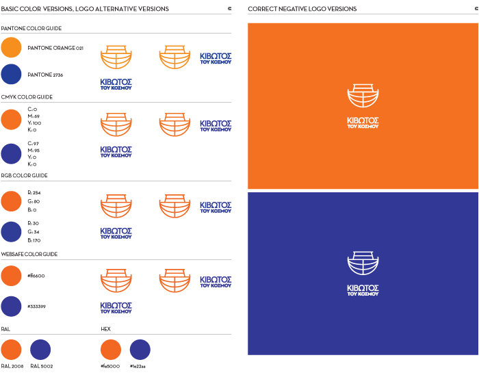
They must keep this document and send it as-is whenever a partner (editor, manufacturer, developer) is requesting it.
None other than the designer, can change the colors or the form of the logo designs that have been defined and agreed.
08. sage rights. Protection of Trademarks.
Logos are always delivered with unlimited rights of use, temporally and locally, defined on the basis of the relevant copyright laws, but copyright rights remain with the creative agency.
The establishment of the copyright rights of the logo should be made at the region that the company is based. In the event that the company later changes owners, in order for the transfer of the rights of use of the brand/logo (which is an asset of the company) to take place, the consent of the designer will be required. In the case of franchise stores, a transfer and usage cost is calculated per owner.
09. Design of the corporate identity.
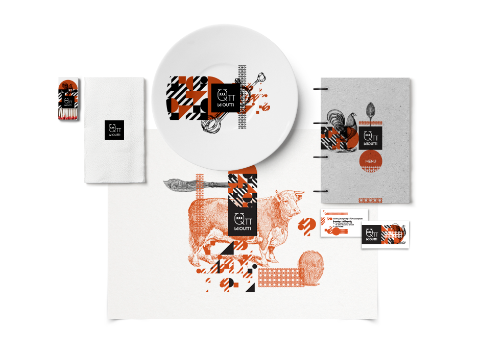
After the logo is finalized, the design of the corporate identity applications follows. In this more mature phase of the project, two different directions are presented. As a rule, the basic corporate applications (business cards, letterheads, envelopes, etc.) are the first to be designed. Depending on the clients’ needs, other more specialized applications (folders, invoices, various special-purpose cards, shop signs or signs for space marking, vehicles, packaging boxes, bags etc.) may follow. Each project is unique and has its own specifications, which are set during the design brief.
10. Production, deliverables and printing.
At this stage print specifications and quantities are set and paper varieties are selected. The choice of the right collaborator (printer) is made. This may depend on things such as printing costs or the specific requirements of the production. The print files are sent to the editor – printer and the printing process begins. The supervision of the final result is done by the creative agency. It is their job to make sure that the selected colors have been printed on the specific paper varieties that were requested and generally make sure that everything looks as it should.
11. Project completion. Design Manual.
Eventually, and if the result corresponds to predefined specifications, the printed applications are delivered to the clients and feedback is requested concerning the proper closing of the agreed project. In special cases, a Brand Manual may be created, i.e. a version that includes all the rules for the correct use of the logo and the corporate identity.
The manual aims to maintain the consistency of corporate identity during the years that this identity will be active, when the designer will no longer be present.
Tags:
brandingThe Comeback is proudly powered by WordPress