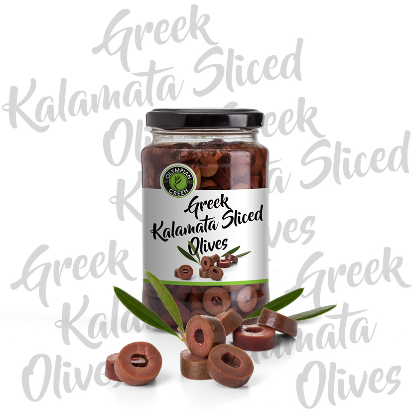
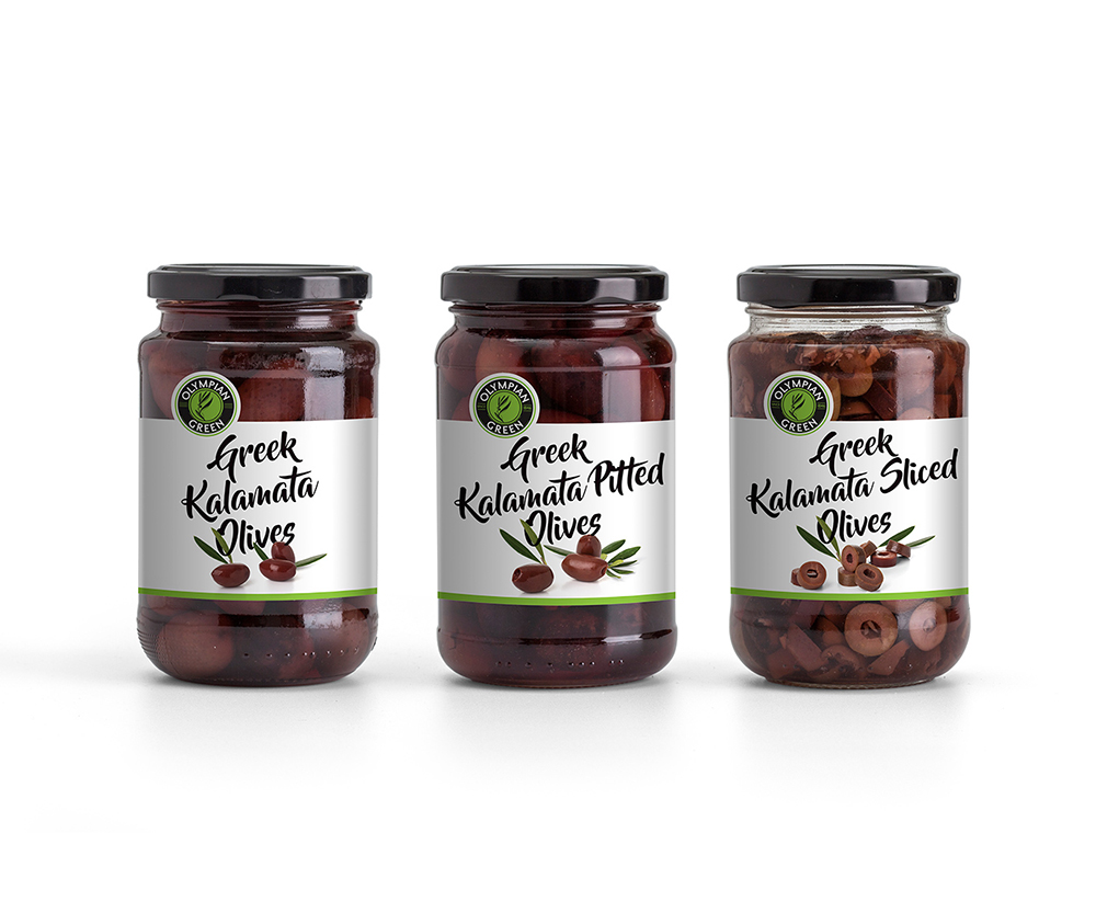
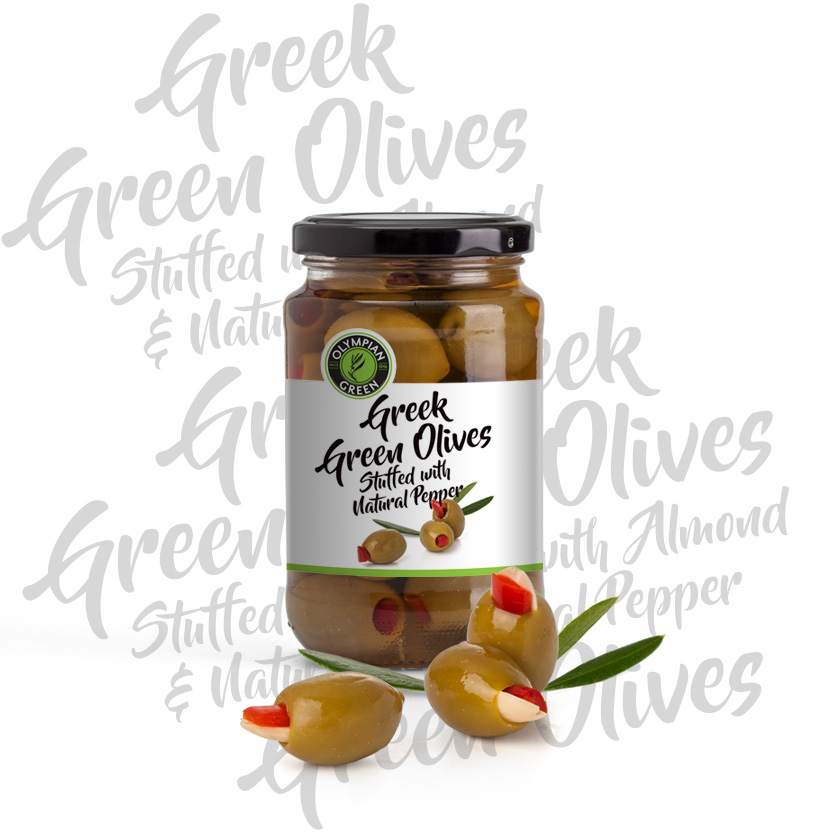
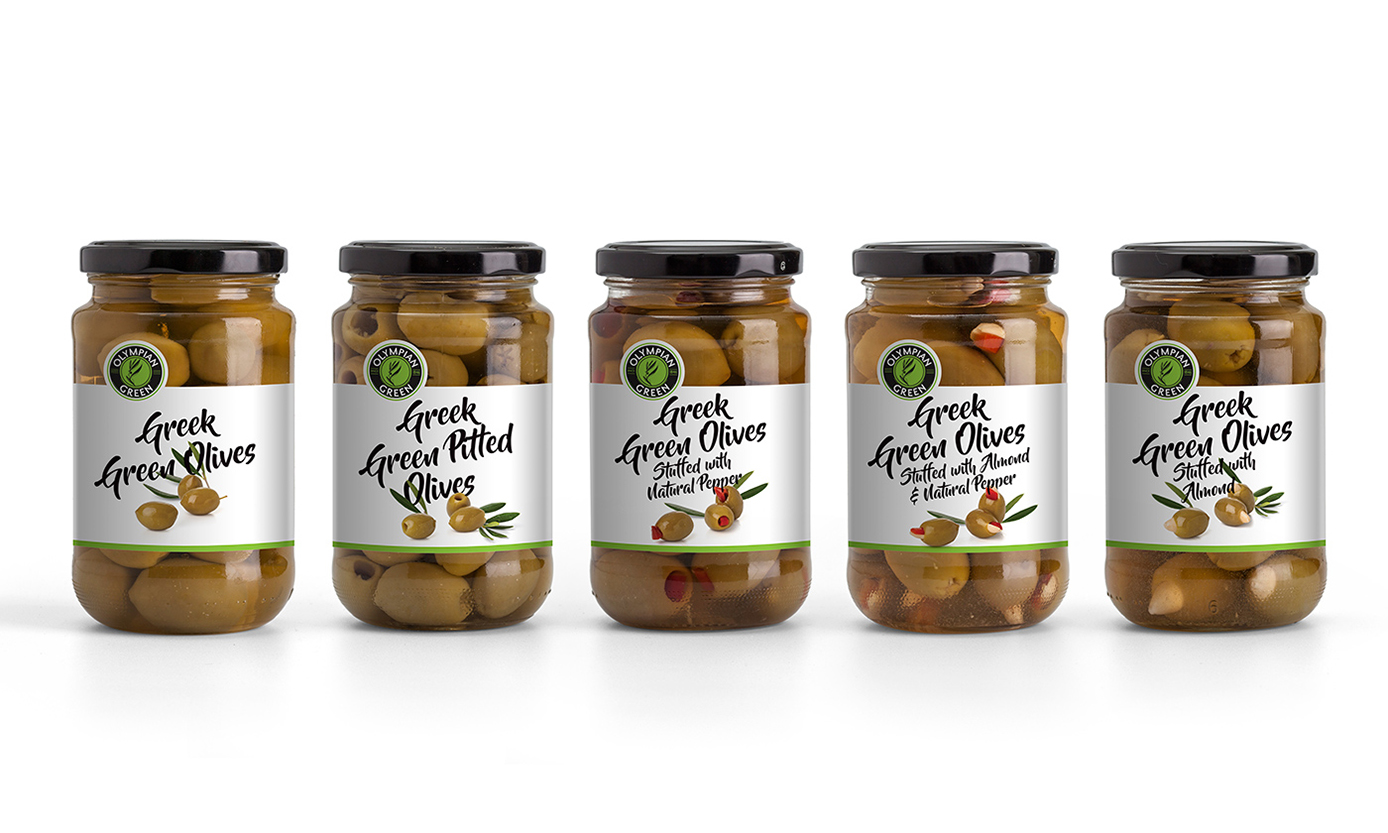
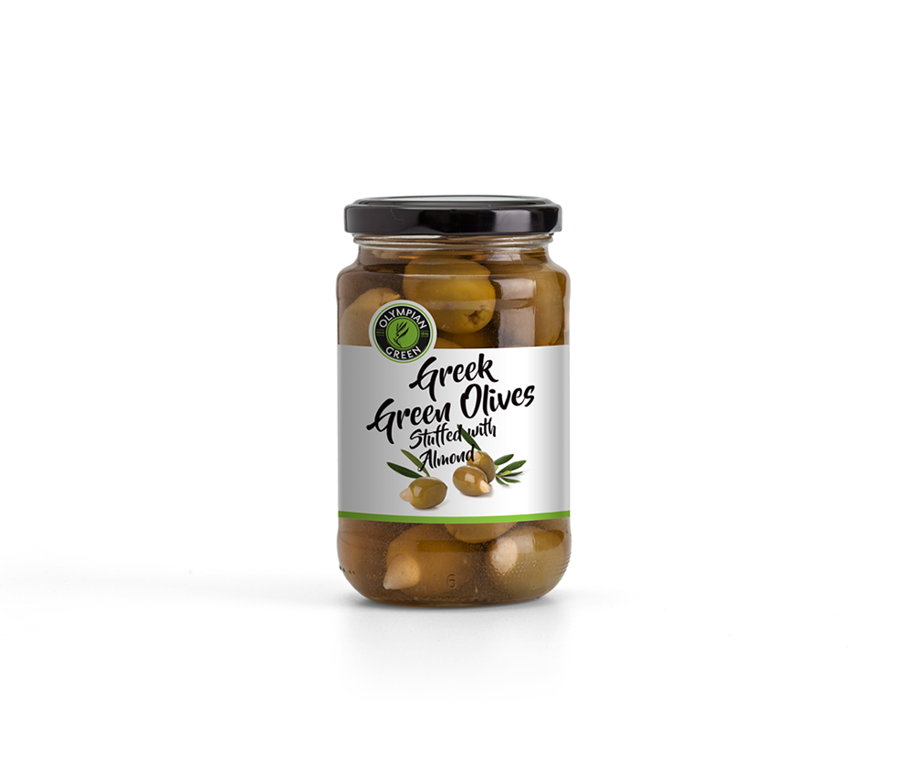
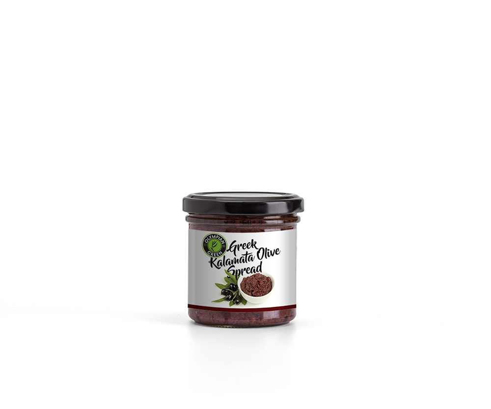
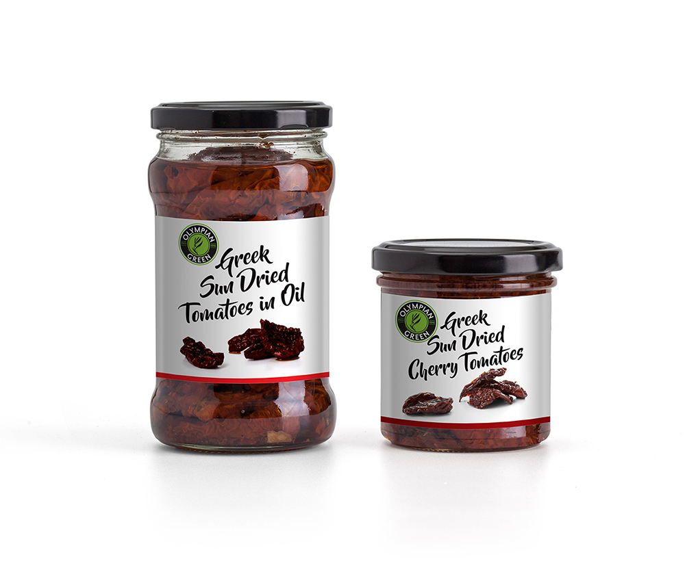
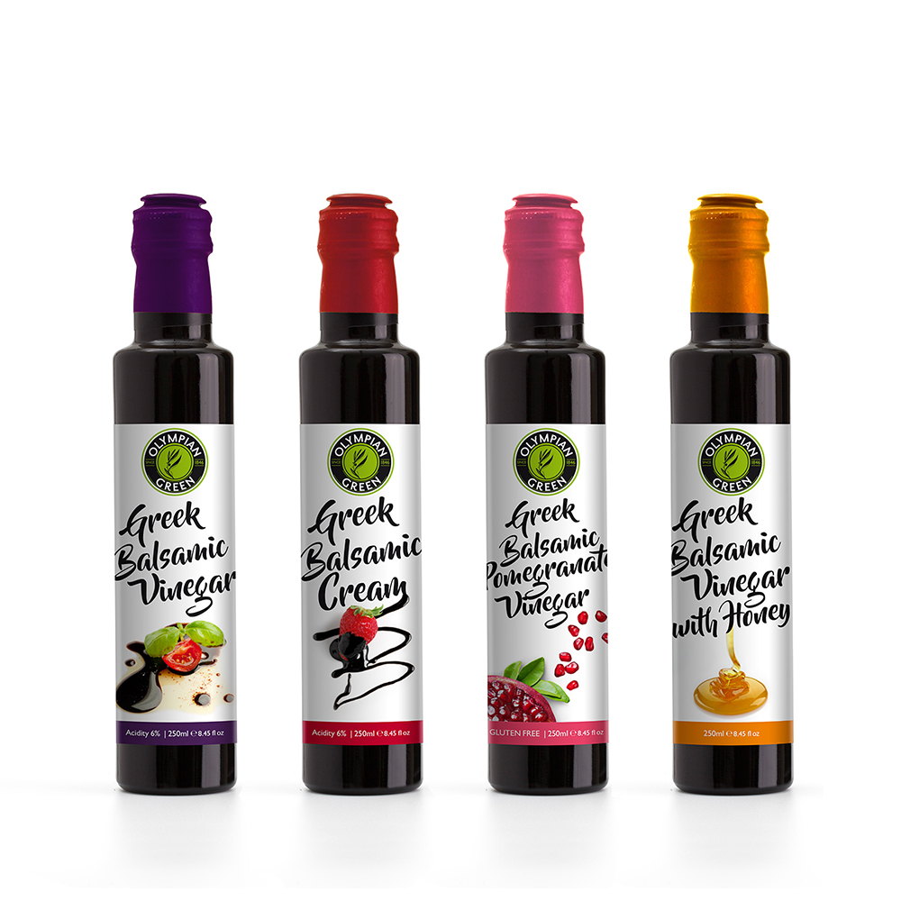
The client requested a packaging design for their series of οlives which were divided into two main categories, classic and green. We also had to use the same concept for their sun dried tomatoes and olive paste. The design solution was simple and effective. Strong brush typography and photographs of all the products shot on white background, (by Ampoo studio) in order to have a consistent result throughout the series.
-
Client
Olympian Green
-
Year
2016
-
Collaborators
Fonts - Stereo-type
Photographs - Ampoo