ORA (Out of Ordinary Agroscience) Services is a greek company based in Athens, active in the fields of special agricultural nourishment products, innovative services and product solutions.
Their main focus is on specialty products that increase crop productivity and quality. They also provide farmers with technical solutions and services that respect the environment.Their main product is a new range of fertilisers that instead of providing the plant with various kinds of nutrients and chemical substances that boost its growth, they actually affect the plant’s physiology in a cellular level.
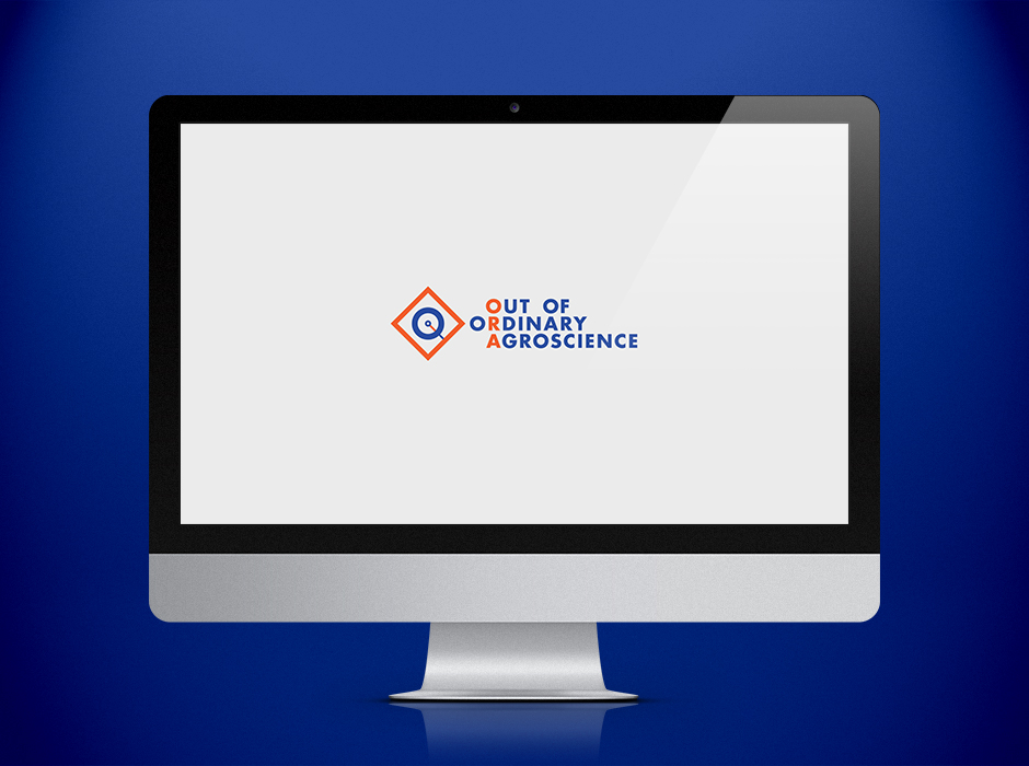
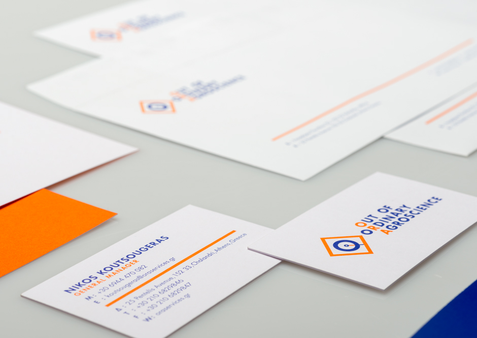
We were asked to create the company’s logo and corporal identity. The brief we were given had two requests: One, the logo should convey how these new products work, and two, it should also convey the character of a new, bold, innovative company.
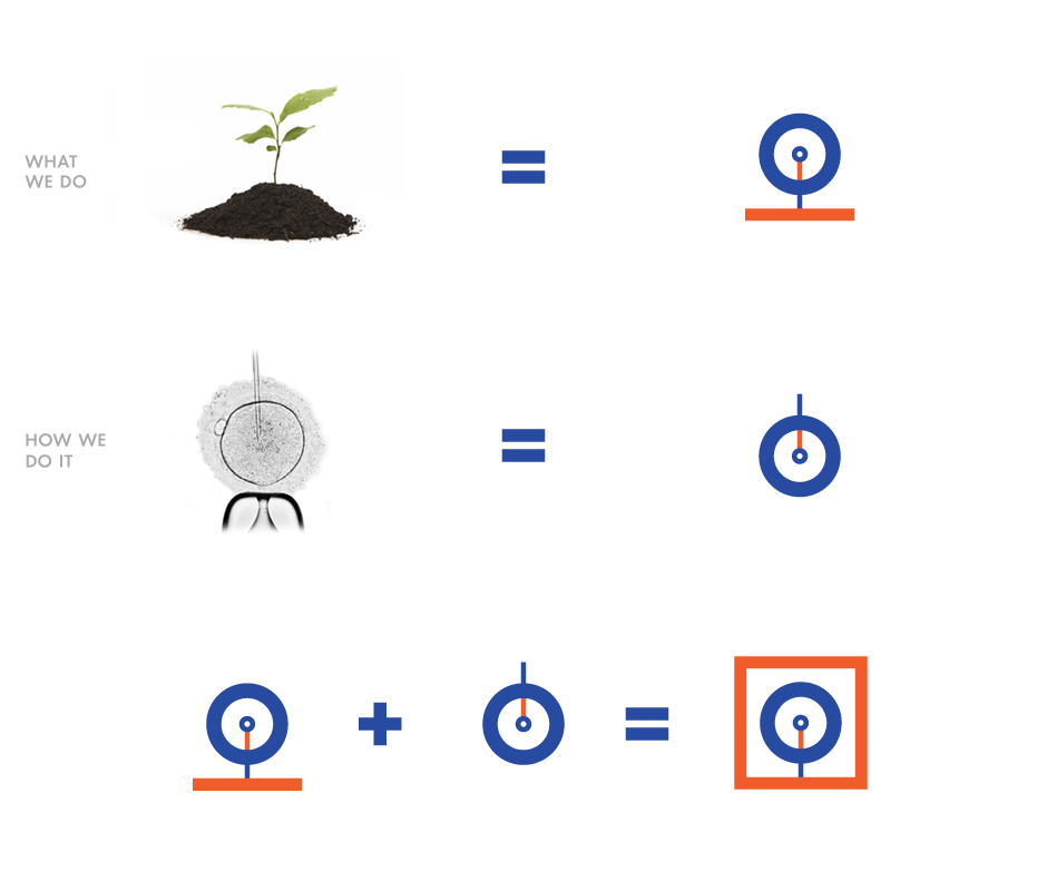
The idea for the symbol is quite simple. We combined the promise that ORA makes to its clients (strong, healthy crops) with its method (ORA products work for the benefit of the plant in a cellular level). Two images that easily come to mind, a strong new plant growing out of soil and a needle entering the cell are combined to produce an “O” shape that stands for ORA.
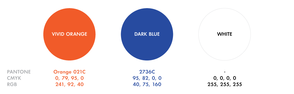
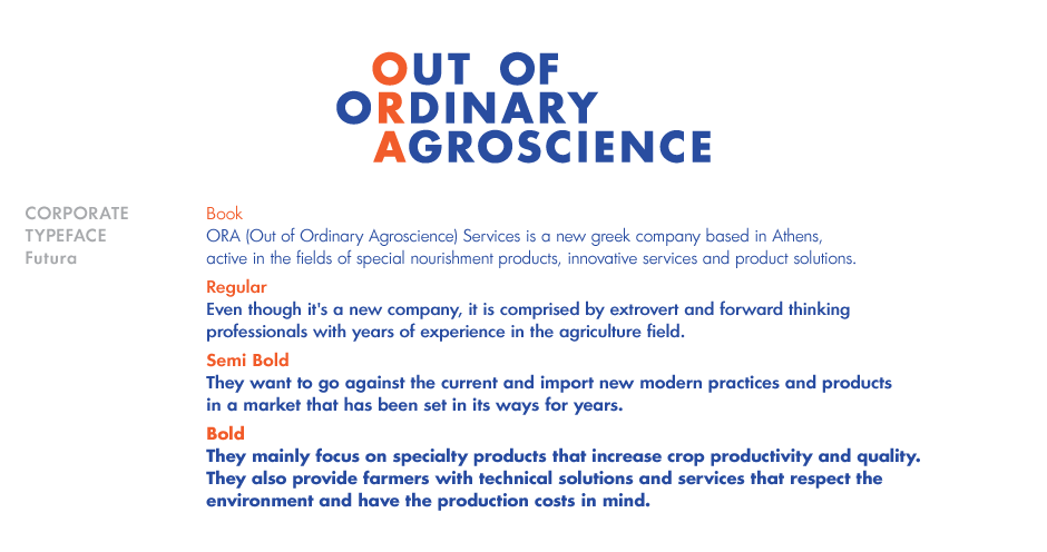
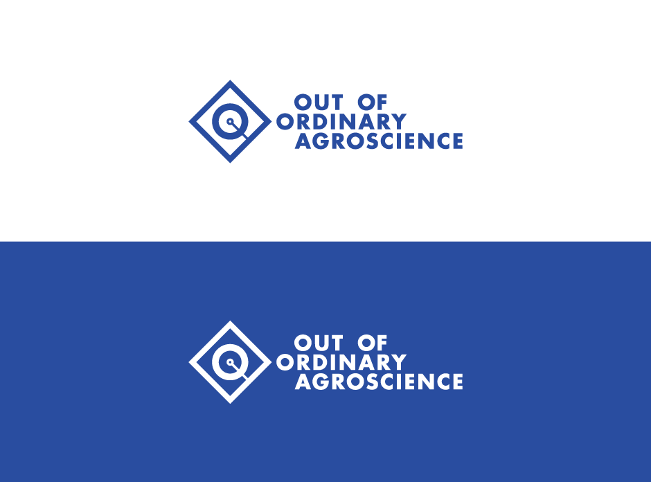
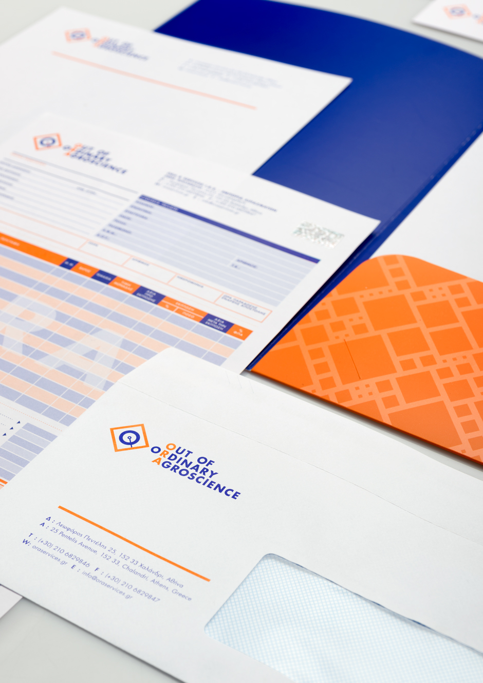
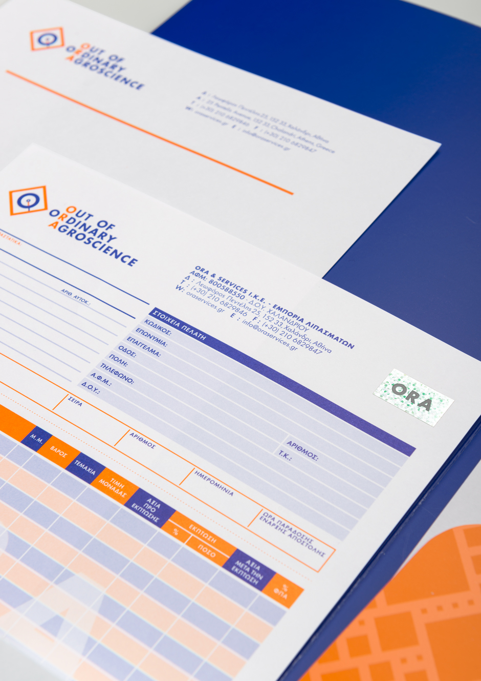
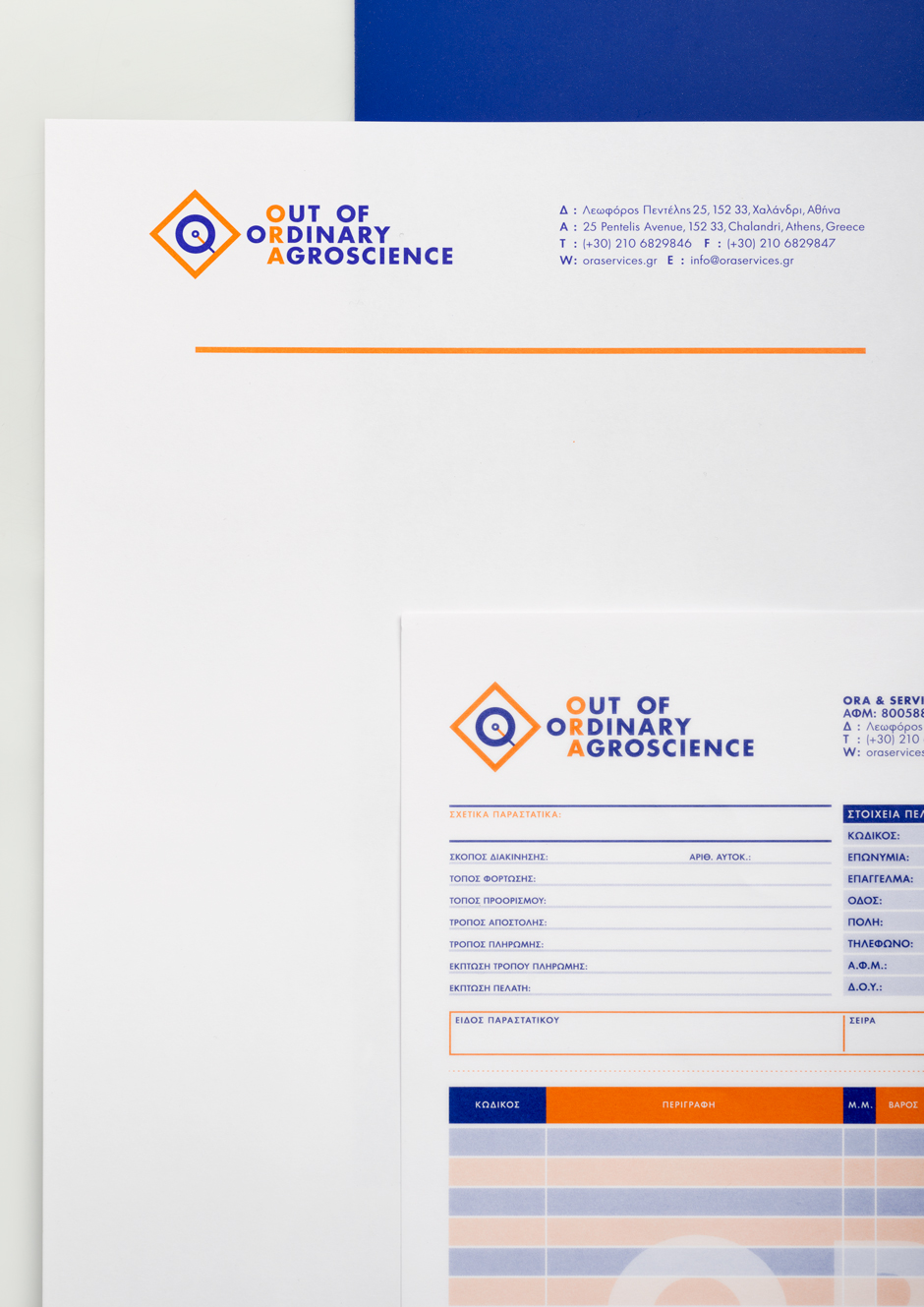
Bold corporate colours were chosen in order to compliment the form of the symbol. Dark blue for professionalism and vivid orange for innovativeness. Corporate typography was treated again with boldness in mind. Futura was chosen for its dynamic forms and the modern character it still possesses.
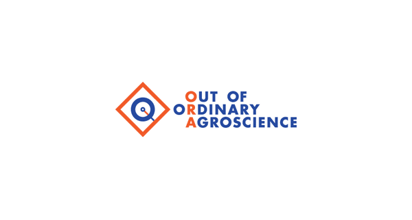
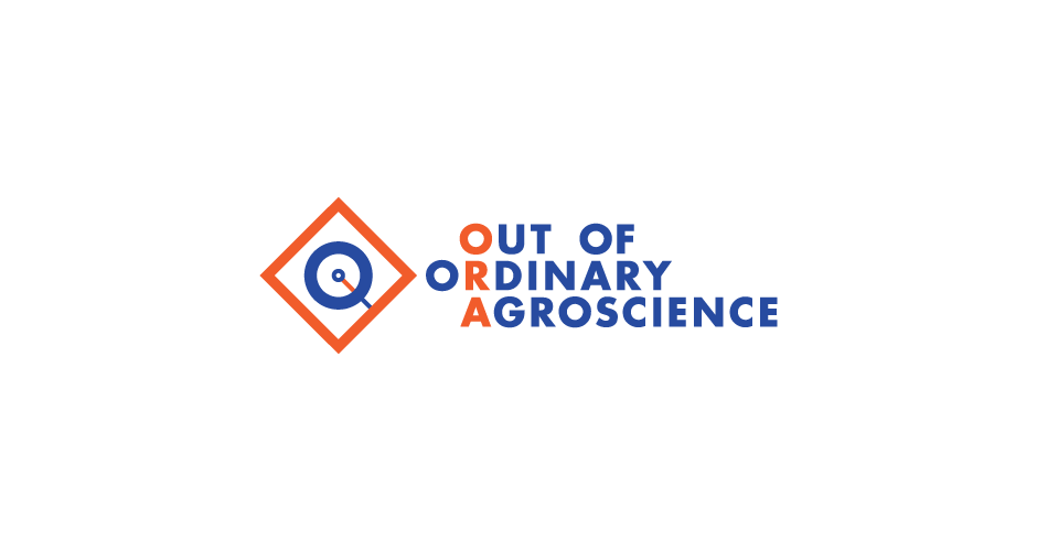
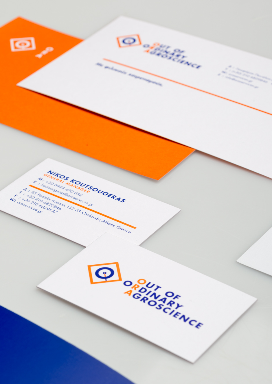
The phrase “Out of Ordinary Agroscience” has a double role. It is the full name of the company, where the acronym “ORA” comes from, and as the same time acts as the company’s mission. It says that ORA, with modern agroscience as its tool, will deliver new and innovative services to its customers.
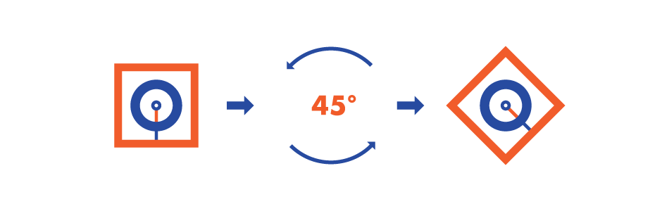
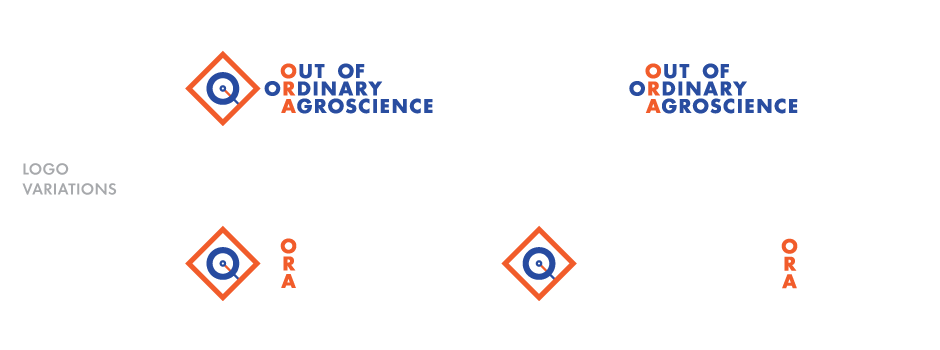
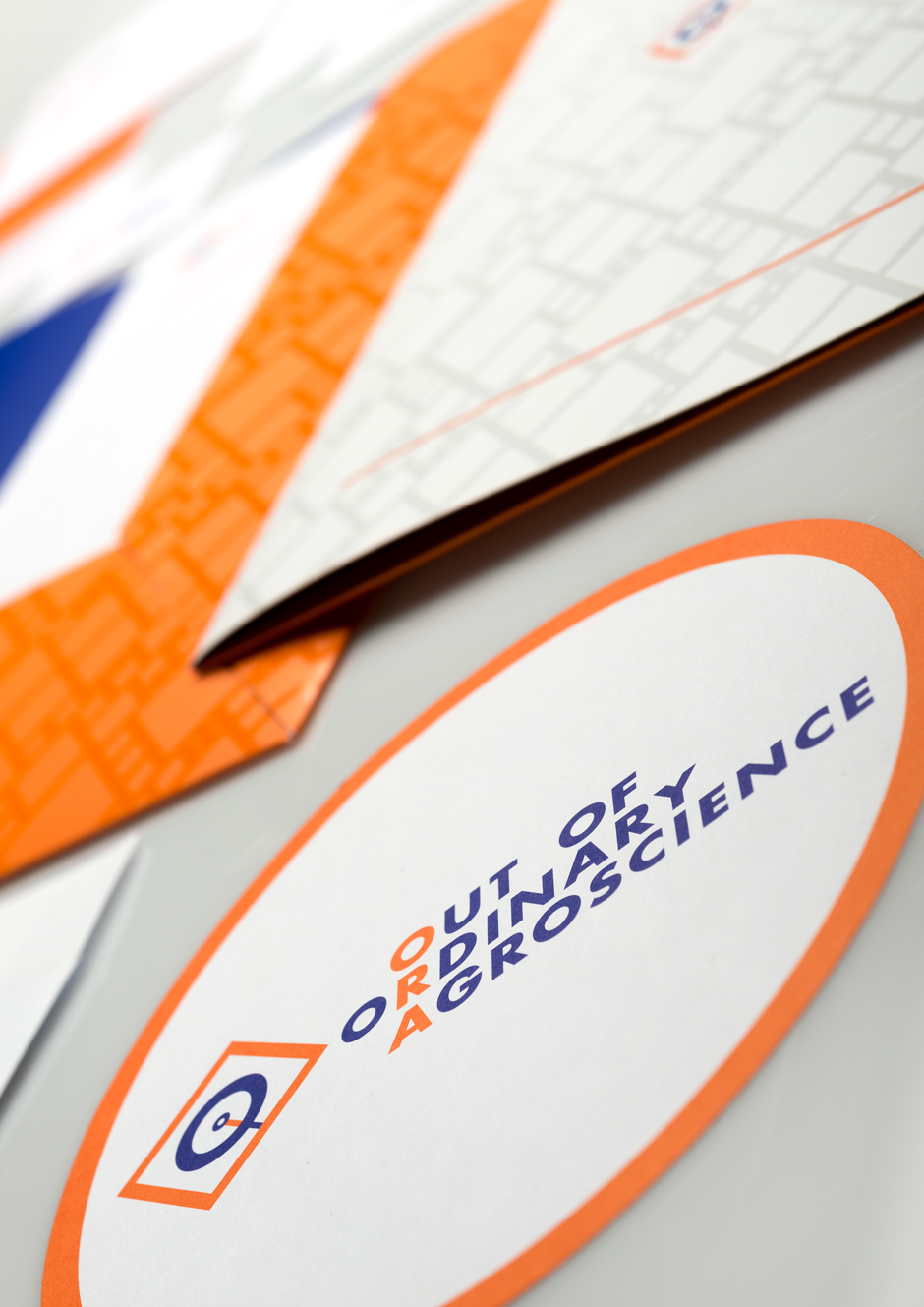
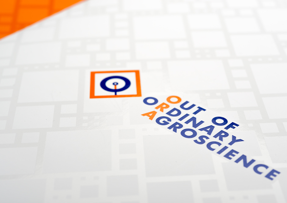
The last step was to arrange the symbol in an angle of 45 degrees in order to give it a sense of agility. Depending on the situation the three elements that make the ORA logotype, symbol, acronym and mission can be used in different combinations.
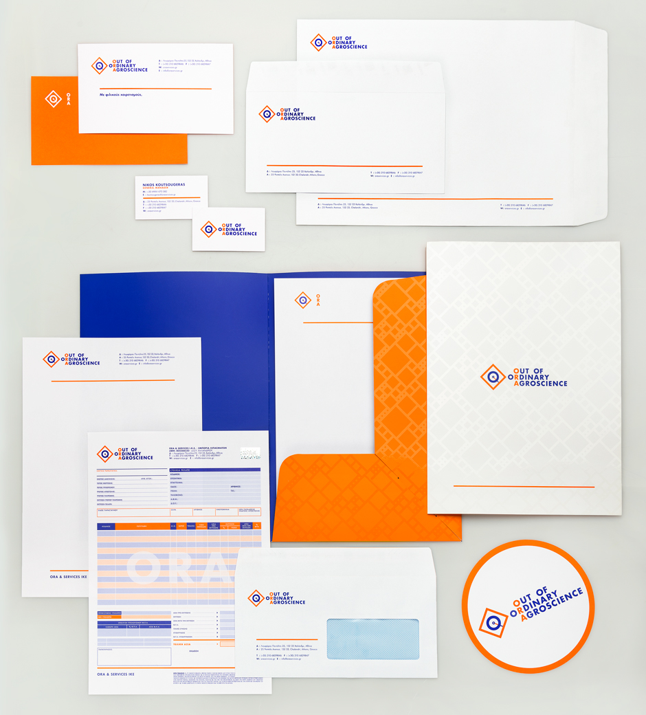
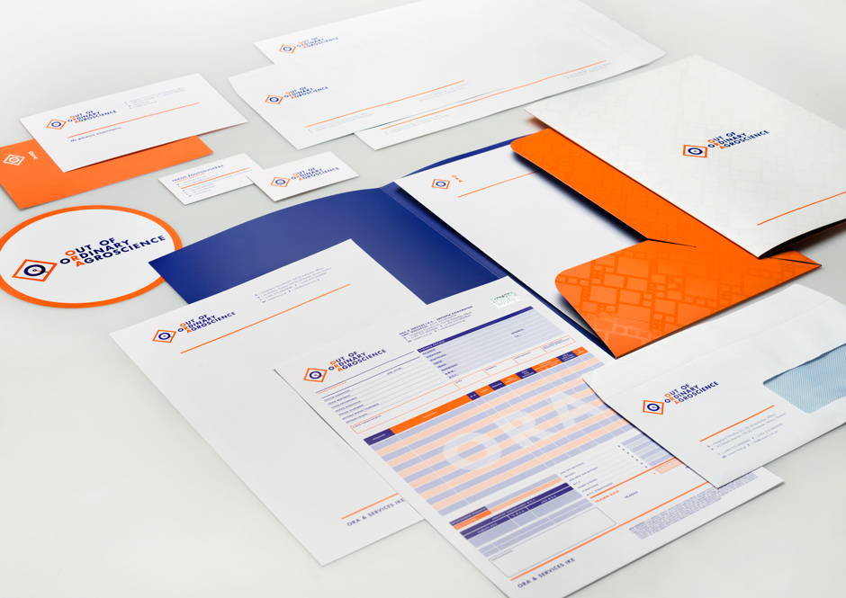
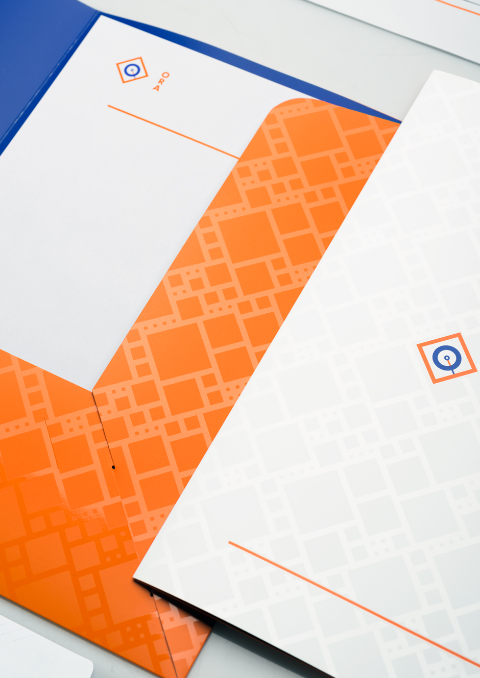
There was a fourth element created for the ORA identity, a pattern based on the rhombus, the diamond shape that surrounds the “O” shape in the symbol. It symbolises the earth as it looks from above, shaped by the farmers who work with itWe used this pattern as a layer of UV on the folder created, one of the applications of the ORA brand identity.
-
Customer
ORA (Out of Ordinary Agroscience)
-
Year
2014
-
Collaborators
Printing - Panos Davias
Photographs - Studio Anastassatos